Description:
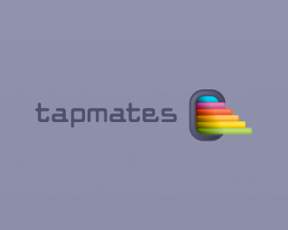
tapmates is an iphone application developer. Taking inspiration from the iphone shape, I showed multiple colours moving out of the main symbol to mirror the swiping gesture made when using an iPhone, giving an interactivity to the brand.
As seen on:
http://www.helveticbrands.ch
Status:
Client work
Viewed:
6825
Share:


Lets Discuss
wow really nice, love the gradients david, nice job
ReplyNice one David, anything to do with the combo of iPhone and airplanes maybe (mark reminds me of the plane window)?
Replywoa. this has very nice colors
ReplyThanks guys.
ReplyThank you for the floats everyone.
ReplyThis is outstanding, I'm a big fan of it.
ReplyThanks Milosz. I really love how the team there adapted it for web use.***!http://tapmates.com/blog/wp-content/themes/tapmates/style/img/logo-tapmates.png!
Reply%5E seriously? i think they ruined a great logo of yours.
Reply%5E Why it look pretty cool this way or another as they made, both are still cool imho.
ReplyI really like how they use it on the site!
ReplyAwesome%3E%3E%3E%3E%3E%3E%3E%3E
ReplyThanks. ****
ReplyPlease login/signup to make a comment, registration is easy