
Description:
Work in progress.
As seen on:
http://www.helveticbrands.ch
Status:
Nothing set
Viewed:
1296
Share:



Lets Discuss
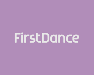
Every letter feels extended but the E. It's not looking cohesive in either line.
ReplyFair point Thrasher317, amended.
ReplyMuch better! I'm glad there's people like you out there doing custom fonts. I'm assuming this is a fictitious client? If not, I think the company name has some fun legs for a mark.
ReplyThanks. It is for a real client. The mark is already defined, just wrapping up the type now :%5E)
Replyi like the name.
ReplyThanks :%5E)**
ReplyPlease login/signup to make a comment, registration is easy