UrbanHome
by HelveticBrands • Uploaded: Jul. 15 '10

Float
(Floaters:
8 )
Description:
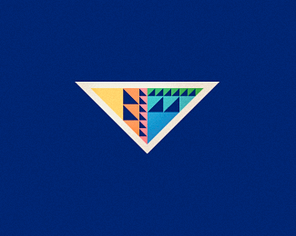
Urban Home is a company specializing in developing small but quality apartments in city centre locations. The solution represents an aerial view of their apartments using different coloured elements for each one.
As seen on:
http://www.helveticbrands.ch
Status:
Client work
Viewed:
2996
Share:


Lets Discuss
What is it supposed to be?
ReplyBunch of tetris puzzles?
ReplyThis is pretty nice Dache ... there is a canal in there right ?
Replyinteresting solution..
ReplyIts a top view, like a map. :) I like.
Reply%5ESo all 9 pieces together are making up the overall shape of the Netherlands?
ReplyI think if it were not for the informations of the logo, I would never think that is a map, depends heavily on the use of typography I think... But it is a good mark, it's beautiful and striking, imo.
Reply%5EI wouldn't see it as a map either, that is why I am trying to figure out if that's even what it is supposed to be...I may be way off. If it's not a map, though, is it just the 9 apartment layouts randomly arranged? David?
ReplyHaha, sorry Joe. I think i'm agree with you, but i say the wrong words... :) i agree with Ben too!
ReplyClever,I like it!
ReplyReminds me of different division rooms of the apartment, viewed from the top.**Nice colours.
ReplyUpdated this one to the final logo. The clients are very happy with their new identity :%5E)
ReplyPlease login/signup to make a comment, registration is easy