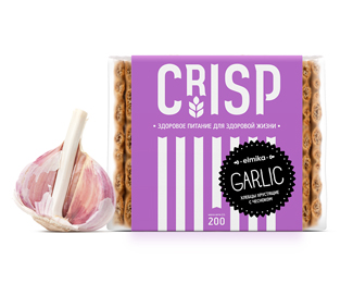
Elmika. Bran&Crisp
by Hattomonkey • Uploaded: Feb. 06 '14

Float
(Floaters:
1 )
Description:
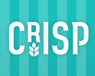
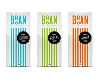
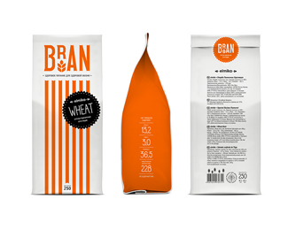
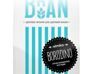
Working out a design for the useful products means to bring positive result by itself. So we especially reverently took new task with a new trademark Elmika, which products’ range includes bran of Bran sub-brand and loaves of Crisp sub-brand. But as it often happens one problem had arisen.
The matter is that bran and loaves Elmika were designated both for national and foreign markets. So we had to present visual image that would be clear for people from different countries. And this task in principle is not so easy.
We worked out a design inspired by the modern minimalism. Looking at Bran and Crisp packages Russian people can see thin stems of wheat, French people may distinguish striped marquises of old bakeries, English people cnote the dynamic of vintage packaging and so on!
In addition all images were created with the help of logos (Bran and Crisp). Different tastes were specified with bright, but natural colors. And original lettering wasn’t missed. We are sure that we could bring maximum benefits!
As seen on:
Status:
Client work
Viewed:
1029
Tags:
lettering
•
bran and loaves
•
sub-brand
•
trademark
Share:


Lets Discuss
Please login/signup to make a comment, registration is easy