Description:
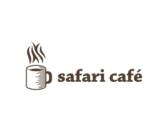
Logo for Safari Café. Steam should have shape of zebra texture. What do you think about it? /UPDATED: Steam :) /
Status:
Unused proposal
Viewed:
3425
Share:



Lets Discuss
I like the illustration a lot. I think it might read more like zebra if the stripes were more vertical. Plus, it would look less like there was a breeze above the coffee.
ReplyNice. I Like the style
ReplyNice style, make smoke more %22zebra%22
ReplyGuys, thank you for valuable advices. I'm going to fix the breeze during today :)
ReplyChanged the shape of the breeze. Background changed to white so as to look more zebra-like. What do you mean - is it better now?
Replythe %22breeze%22 seems a bit too big to me.
Reply%5E Agreed, try it thinner.
ReplyLecart %3E That sounds reasonable. BtW: What is the right word for the stuff over the mug? Is it steam?
ReplyI like how this is going better and better. i would recommend to stick Alens very good advice with making subtle S and C from steam. Personally I would like to see more %22zebra%22 lines, maybe on mug, too. This is gonna be cool logo, I feel it.
ReplyI don't like the idea of zebra stripes on the mug because zebra mugs are too common. I like it as it is - in the steam.
ReplyWhen I drive into a Shell station, I ask for a Big Mac and fries. %3B)
ReplyAgree with Alen, branding should be on a mug. Ithink it will make identity unfolded.
ReplyThank you all for inspirational discussion. For those who like to see zebra texture on the cup, here you are: http://logopond.com/gallery/detail/117606
ReplyWhat about zebra steam above the mug, and on the mug a grassy texture? That would certainly tie into the idea of %22Safari,%22 and it's more of a mix of the two versions you created.
ReplyEven if I clearly understand the marketing goal behind putting the zebra pattern on the mug, I definitely think this logo works better. *Another idea would be to recreate the global shape of the mug using only zebra stripes (and negative space) but without the mug graphical outlines. May be too hard or impossible to do though...*Regarding type, I'm not sure it fits well with this activity, too much techy/cold/warmless for me... Have you try some serifs, %22clarendon-ish%22 or slab-serifs with soft curves? I think some could fit better... Keep up the good work, each update was an improvement!
ReplyExemple of what I mean by recreating the global shape without the outlines: http://logopond.com/gallery/detail/116893*Glass shape and volume are suggested by liquid forms and gradients.
ReplyThomas, thank you for valuable advices. I think that global shape without outlines is not the right fit for this mark, but I've changed the font to slab serif one. What do you think, is it better now?
Replyvery cool idea and execution
ReplyThank you Craig!
ReplyThat rocks! Far better IMO, more warm, human and friendly. Another nice improvement Gotty!
ReplyThomas thank you for your kind words.
ReplyNice one I like it!
ReplyThanks Oski, really appreciate it.
ReplyGreat concept here, Rostislav.
ReplyThank you, Sean!
Replygreat concept ...love it ...
ReplyI really digging the idea and execution! Great job mate!
ReplyThanks, Bernd and Effendy!
ReplyPlease login/signup to make a comment, registration is easy