Description:
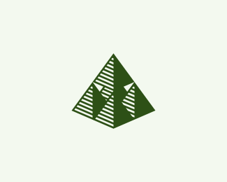
Logo for secret society. It's pyramid standing on tops of four other pyramids creating together one big pyramid.
Outlined version. What do you think, which one is better?
Status:
Client work
Viewed:
3244
Share:



Lets Discuss
great work
ReplyThis one is better imo. The outline makes it a lot stronger and compact!
Replyinteresting concept, looking better than the first one.
ReplyYep, prefer this outlined version.
Replylike this version :)
ReplyThat's some fresh stuff.
ReplyThank you guys. Sounds like this version wins :)
ReplyThis has the feel of some of the imagery found on money. Great work! Very good concept and execution.
ReplyLumavine, thank you for your kind words!
Replyreally cool concept! that secret society is it like some sort of sect? :)
ReplyT%F8mme %3E So far I know it's nothing like that, but you know it's pretty secret :)
ReplySuperb mark!
ReplyPlease login/signup to make a comment, registration is easy