dot logo
by Fogra • Uploaded: Feb. 07 '10

Float
(Floaters:
26 )
Description:
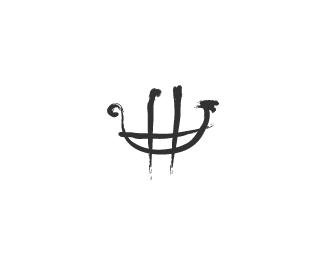
Just to prove how close this was to Mike E's 'Dot Gang' logo. At least it thankfully wasn't chosen by the client.
Status:
Nothing set
Viewed:
15044
Share:


Lets Discuss
nice
Replysavage mark... a bit like the cingular logo doing his impression of Marvels Multiple man!. Though all in all, superb execution Fogra, well done mate.
ReplyThanks guys. Mike's was first.
ReplyThey really are different though, even if they seem exact.
ReplyAlways the way with patterns, eh?
Reply%5E true. My pattern was 3 rings of increased sized dots on outer perimeter, connected smaller at middle ring. That's why it's a bit diff.
ReplyI like em' both, despite how similar they are.
ReplyI agree with Joe, a small sub trend maybe? %3B)
ReplyPlease login/signup to make a comment, registration is easy