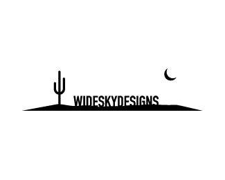
Description:
Logo redesign for Wide Sky Designs web design Co. (Not chosen)
As seen on:
http://wideskydesigns.com/
Status:
Unused proposal
Viewed:
4007
Share:




Lets Discuss
this would have been stronger if the text had been put below and the moon raised up. right now the text is taking up part of that wide sky.
ReplyNice one Sean - this is my pick of the three. It's simple but tells a story.
ReplyPlease login/signup to make a comment, registration is easy