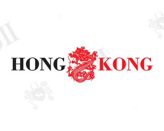
Hong Kong Restuarant
by ElephantMark • Uploaded: Feb. 26 '08 - Gallerized: Mar. '08
Float
(Floaters:
18 )
Description:
This is a restaurant in Harvard Square, Boston MA. This has been actually our longest running restaurant we've done identity work with, it's been using our ID work for over 12 years.
As seen on:
ElephantMark.com
Status:
Client work
Viewed:
6,221
Tags:
restaurant identity design
Share:

Lets Discuss
Hey Sisu, I go to this restaurant from time to time :) I do have to add that the center mark is a little too intricate for a smaller size logo. Maybe you can place a less 'busy' logo in the middle. *When I think of Hong Kong this is what comes to mind, what about something more modern like their crazy awesome skyline?
ReplyHello Sizu,**I agree with gypseemoth about about the intricacy being too much for a logo. A local sushi restaurant has a similar problem... whenever their logo is printed on something small like a package for a pair of chopsticks it does not look good.**Maybe you could reduce this to just the face of the dragon, looking for a few very stylized strokes that capture it? You might then save the full dragon to use in other compositions... like when filling space in a menu layout.**I like that font. I'm not sure why %22Hong%22 is black and %22Kong%22 is red, unless there's some sort of idea that the mascot is named Kong and thus is in the same color? Unless there's a motivation it might be best just to make %22Kong%22 black...**Regards,*met%26aelig%3Bducation
ReplyHow about you ease up on the spamming...
ReplyPlease login/signup to make a comment, registration is easy