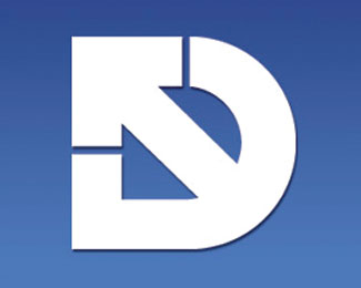
Design Northwest (DNW) Logo Idea 3
by Design-Northwest • Uploaded: Nov. 02 '10
 Logo Idea 3")
Float
(Floaters:
2 )
Description:
Want to use the "D" as the focual point, but show the northwest within the logo also.
Status:
Unused proposal
Viewed:
2169
Share:


Lets Discuss
Out of all the Design Northwest logos, I prefer this one. It's simple and understated. The others with the arrows are nice, but I think it interrupts the white space of the 'D' character. All in all, great concept.
ReplyThanks mate!
ReplyPlease login/signup to make a comment, registration is easy