Float
(Floaters:
15 )
Description:
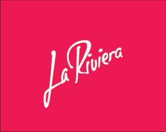
Logo for a perfume store. Need some suggestions.
Status:
Work in progress
Viewed:
2229
Share:


Lets Discuss
The two As should be different, not the same. And about the dot: it does look a little pushed over. Maybe it should over lap the R. And if I was really picky, I might say the loop on the L is a little strange/unnecessary.
ReplyWell, it isn't a perfume, it's a chain of perfumeries from Central America. They want a %22feeling of a luxury boutique%22. Logo must express luxury, femininity, nature. Obvious I put more accent on %22luxury%22 and %22femininity%22. *I chose to put different A's to show more personality. But probably I'll modify a bit the last A to resemble the first.
ReplyTo me it looks great, Daniel.
ReplyThanks Milou!
ReplyOu!*Something new in calligraphy*Me very likes!
ReplyThank you so much!
ReplyPlease login/signup to make a comment, registration is easy