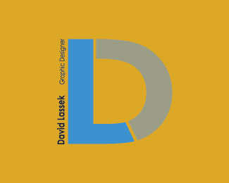
Description:
Class assignment to create a personal logo. I struggled to get out of my comfort zone with this one. For those rude commenters out, yes I know there still is tweaking to be done.
Status:
Student work
Viewed:
1334
Share:


Lets Discuss
Nice design. It seems to read %22L%22 first, then %22D%22... you could call it %22Lassek Design%22 and the initials would seem to read in the correct order, and %22Lassek Design%22 would be a lot easier to read than your whole name and trade. This won't scale down too far.
ReplyI've seen this particular LD combination done and used by at least two other designers. **... just remembered one of them - www.leschinskidesign.com*
ReplyI agree with what kinetic said, Lassek Design would easier to read and make more sense with the design. This is by far your best logo, in my opinion. Headin' in the right direction.
ReplyI agree with everything said. This has some potential, however you need to keep in mind it's been done before. **Best of luck!
ReplyNow that you guys mention it, it does seem to show L before D. This is one the I want to tweak to see what I can come up with. Epsilon, I was unaware of this but like I said, I want to play with this to see what else I can come up with to %22make it my own%22. Thank you guys for your input.
ReplyI had an option just like this for the 'Debut London' project...but indeed, in a setup like this, there's just no was to avoid having the 'L' read first.
ReplyPlease login/signup to make a comment, registration is easy