Description:
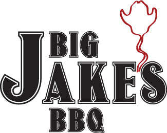
Class assignment to create a logo for a fictional company. I tried to make the smoke come as a cowboy hat
Status:
Student work
Viewed:
860
Share:


Lets Discuss
When I first saw your logo, printed out my eyes went for the smoke! i think that it was a great Idea but i honestly didn't see the cowboy hat. I only knew what it was until i came on here and read what you wrote. I love the font that you pick out, and this is just opinion, maybe moving the BBQ over to the right, there is something about the placement..
ReplyI honestly can not really tell it is smoke offhand. I like the idea, but I do think it needs work. The cowboy hat shape to me looks more like the skull of a steer, the brim is the horns. It needs work but I like the idea overall.
ReplyThank you guys for your input
ReplyPlease login/signup to make a comment, registration is easy