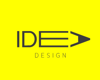
Description:
alternative version of the Idea Design logo, uses the D reflected, in the other version it acted like an eraser but reflected the logo is more legible.
Status:
Just for fun
Viewed:
30578
Share:

Lets Discuss
@zeebrands Cheers glad you like it, love the word play in the comment too :)*
Replyhttp://dribbble.com/shots/232317-Idea?list%3Dfollowing
Reply@Contrast8 any idea when that was uploaded? Funny he just happened to have had the same idea as me around the same time, also annoying cause he's getting more views out of it
ReplyDOes anyone know where you can find the exact times a logo was uploaded? on here or on dribbble?**Cheers for any help**Chris
ReplyWow, same idea on the same day. Probably a huge coincidence.
Replyi sure hope its a coincidence.. ?
Reply@ jurcek Only you can answer that, strange you have all your logos on here and dribbble except that one. I know I sat down designed this then uploaded it without seeing it anywhere else(this is the 2nd version, I deleted the 1st as this one was better) I don't mind you having a design exactly the same, if thats how you work, I'm happy with the feeling that I thought of, designed and created this without seeing it anywhere else. I'm not sure why I would ask logopond to send you a message on dribble if I knew I had stolen the idea myself. If by the amazing coincidence you did design that yourself without seeing mine 1st, then fair play it is a good idea isn't it :)
Replyit is a great idea.. wish I thought of it!**That's what happens when one person is designing for 'fun' and someone else is, presumably, solving a business problem.**Hope you guys resolve it.
ReplyI'm a sucker for pencil marks.
ReplyPlease login/signup to make a comment, registration is easy