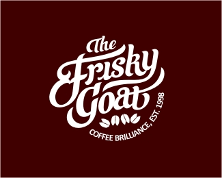
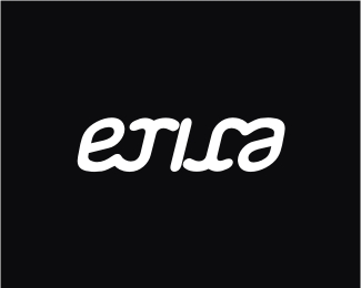
The Frisky Goat Final V.
by Chanpion • Uploaded: Jul. 23 '12 - Gallerized: Jul. '12

Float
(Floaters:
99 )
Description:
Approved version. At last! Now onto merchandise.
Status:
Client work
Viewed:
38299
Share:


Lets Discuss
Yes, yes, this sure is one of my favorite, Norman!
Replyagree !
Replyvery very!
ReplyThis is phenomenal work! Fav'd/floated.
Replythe hooves as coffee beans is genius. the type is simply gorgeous. the natural containment shape is beautifully balanced. all in all this is an alright logo.
ReplyFantastic Chanp.
ReplyBravo!
ReplyAbsolutely love this word mark
ReplyThe hooves! Top notch mate.
Reply1
ReplyNice flow! I wish the hoof / coffee bean was bigger since it's such a good idea... Like as the "o" or something.
ReplyThank you all for the pos feedbacks and the G spot! The client is gonna luv it! This was quite a trek to get to where it is now but the client and I are very 'satisfied' with the outcome.
ReplyReally glad that people are noticing the hooves/beans/sexual connotation part of the logo.
@durand: Due to its 'explicit nature' the hooves were made more subtle so it doesn't offend the more conservative clientele. However it would be played upon in the collateral.
wow didn't notice the bean placement, sneaky sneaky
ReplyVery true nice work!
ReplyGreat logo.
Replylovely
Replygreat
ReplyClever. The hooves-coffee beans thing. Very nice work!
ReplyI hope they'll be selling shirts because I already want one. I love this.
Replynice mark!
ReplyThanks guys! Much appreciated. @Tab: Polos with the hoofs on the back and logo on the front are in the making for the staff uniforms. Maybe I can convince them doing Tees for sale! Not a bad idea actually. Cheers!
ReplyI love this ., Really awesome type, lovely lovely lovely :)
ReplyImmense work all round. An all time classic...
ReplyAmazing!
ReplyThis is GOOOOD! I feel Frisky for coffee now :)
Replywhat typeface is this? or did you create it yourself? it looks great!!
ReplyThanks again guys! The client is looking forward to the new branding of his business.
Reply@Roban: Thanks! It's custom type.
Amazing type!
ReplyWow Norm, this has been quite the evolution. I really love how far you've taken this one. That type is superb. It's fun and full of movement, and as Colin pointed out wayyyyy up there ^ the natural containment shape really adds a sense of completeness. Love what you've done with the beans/hoofs. I remember that on previous versions, but it's wayyyyyy more subtle/subliminal now. Really great mark, man. You should be super proud of this one.
ReplyBeautiful design.
Reply@Luka, Jon and Jovan: Thanks fellas for the kind words. Much appreciated on the pos feedbacks. Really stoked you like the hoofs and what it um...stands for Jon! It was quite amusing to see the reactions on the staff's faces when they finally realised it was more than just coffee beans they were looking at. They also have fun pointing it out to the 'less conservative' customers as well! Wink wink! Still getting all the collateral approved. I had a ball working on this project!
Reply@David: Done as requested! Cheers mate.
excellent work on the type mate... you need to teach me how you do this bud..
ReplyHows the family?
Please login/signup to make a comment, registration is easy