Description:
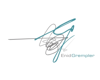
A proposed logo for a photographer that specialises in weddings and functions. She wants it to bring out the quirkinessand spontaneity in her as well as conveying a sense of excitement.
Status:
Nothing set
Viewed:
6831
Share:

Lets Discuss
I like this alot....the combination of the 'e' and 'g' is very nice! good work!
Replyowen did that right... he did didn he... yeah owen did it!
Replyhe's got his dads flair:)
ReplyI like the freeflow apoch a lot, would be cool to explorte dofferent typefaces and upper, lowercase variations, Overall a great job.
ReplyThanks Walter! I'll see what happens. The client has ran away and have not heard from her for awhile : (**Yeah nav, and he left slobber all over the friggin mouse! Geez these kids, I tell ya....
Replyneat! I like the concept
Replyconcept!? theres no concept. unless dumping on some paper and then tracing it is a concept. this logo sucks.
ReplyI agree with jungle. This one would work if you cleaned up the grey squiggle.
Replyis the grey scribble required?? otherwise excellent!!
ReplyI love this.
ReplyPlease login/signup to make a comment, registration is easy