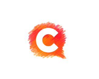
Float
(Floaters:
22 )
Description:
Second concept for Colorvox, a designers community.
Status:
Client work
Viewed:
4192
Share:


Lets Discuss
Is it obvious that it's a speech bubble? :s
ReplyYeah definitely. The C is too perfect for me though. It should fit with the overall theme of the rest of mark. Roughen it up a little bit and don't make it so symmetric. Just my opinion.
ReplyIt is kind of too round for the speech bubble that are typically squished vertically.
Reply@Joe- Yeah, I've been debating back and forth on that one, and presented a version of both to the client. Of the two they preferred the solid, so that's what I'm going to work with. Thanks though!**@epsilon- True, although I am sort of fond of the shape. I'll definitely look at it.
ReplyI like it as it is - the 'sketchy' bubble with juxtaposes the clear 'C' really nicely. Like the colour use too.
ReplyOh, yes, the bubble is really well done, I was totally going to compliment it, but forgot :)
ReplyLoving the colors!
ReplyThank you cseven, saawan (got it right this time %3B) ) and epsilon!
Replyit looks so great!
ReplyMuchos gracias Relis!
Replyl really like it chad...good job.. i think rough edges and a asimetrical C would have worked better...but after all its the clients choice..good luck on this one
ReplyI would love to see this incorporated with the text... And what about the rounded C form maybe (rounded ends), I think it would fit the enclosure much nicer...
ReplyYeah, this project eventually got dropped. The whole business went under before it got off the ground, apparently- but I think you're right. I'll tinker with it for the kicks.
ReplyI like effect you used :)
ReplyWhat program do you use to make your logos?
ReplyPlease login/signup to make a comment, registration is easy