Wensel Media
by ChadSanderson • Uploaded: Oct. 05 '09

Float
(Floaters:
9 )
Description:
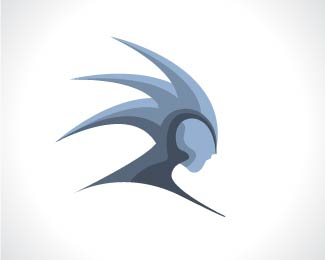
Logo for a start up independent recording studio. They wanted the logo to be bold and avoid the traditional sound icon (notes, discs, etc.) It's still in the process of being refined, so any comments would be nice.
Status:
Client work
Viewed:
2796
Share:


Lets Discuss
This has legs! **I like that I can picture this morphing into a sound wave. Or into a mixing board.
ReplyThank you chirp! I was definitely going for a subtle sound wave, but I can see a mixing board now too.
ReplyThanks man, I appreciate it. :)
ReplyCan I make a few comments. Is there any way you can even the vertical join in the middle so you have more symmertry?. Also, does it need the double stroke? Dont get me wrong, I like a good old outline but sometimes it takes away the purity of a strong mark. I love this logo though... It's going in my favz!*
ReplyPlease login/signup to make a comment, registration is easy