Hannover v3
by Carlove • Uploaded: Feb. 24 '10

Float
(Floaters:
44 )
Description:
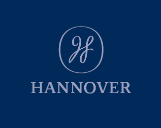
Hannover is a men fashion boutique. There is letter 'H' in the middle of the sign.
Status:
Unused proposal
Viewed:
2703
Share:


Lets Discuss
Strong, unique, simple and memorable mark. Great job done. Shame it was rejected.
ReplyPretty polite and classic. I like it.yeah there is an H in the middle. didnt get it right away.*
ReplyTough client. good work.
Replygood mark
Replynice :)
Replygot the H right away, very nice.
ReplyYea this one's nice too.
ReplyAgreed nice
Replyexcellent... shame it went unsused... what did they go for?
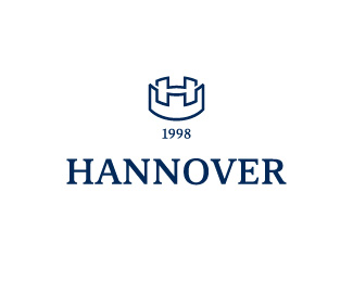
Reply%5E check the other one, it's in the gallery.
Replyreally nice work. love the mark great type choice also. can't believe they never chose this.
ReplyI like both, cool work carlove!
ReplyMany many thanks. I did not expect.
Replylove both the hannover logo. the subliminal H is nice. **:)
ReplyPlease login/signup to make a comment, registration is easy