Hannover v2
by Carlove • Uploaded: Jan. 20 '10 - Gallerized: Feb. '10

Float
(Floaters:
93 )
Description:
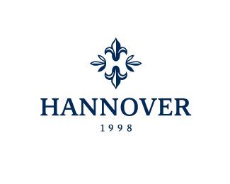
Hannover, born in 1998, is a men fashion boutique. There are a crown, a turret (tower) and letter 'H' in the sign.
Status:
Unused proposal
Viewed:
8221
Share:


Lets Discuss
This is very nice looking. Clever!
Replygreat %3B)
Replyyo!
ReplyVery elegant.
ReplyElegant, simple, direct, maybe a tad smaller text part but nice feel to it...
Replyclever and elegant. also i agree with Alen about the text being smaller.
ReplyNice! don't know why, but the first time I raed it as HANGOVER :) Maybe something is to heavy in here, or I simply need a drink %3B)
ReplyYes, the date tends to clutter the otherwise nice design.
ReplyThis is fantastic
ReplyLove this. Well done.
ReplyGreat mark. Shouldn't the %221998%22 go below the HANNOVER type?
ReplySweet.
ReplyThank you all. I'm very glad. And thanks for the comments.
ReplyVery impressed.
Replywow this is a fab piece. I feel a little depressed after seeing this as I have something similar on the gallery, I feel depressed because it makes mine look so inferior! This is one for the favs.
ReplyAgree with the comments above, the type could be smaller. But great concept, like this one very much!
ReplyThanks again.
Replyalso strong and classy
Replystrong logo :) i like it.
ReplyStrong as a wall! Great!
ReplyBrilliant!
ReplyGreat logo. What font is that? aAre you able to send me it to me I would appreciate it. **aaron@kmvfmedia.com***
ReplyGood job!
ReplyMany thanks! It is nice.
ReplyI really like this, it's upscale and clever.
ReplyVery nice. Feels very 'Established'.
ReplyDefinitely nice as well %3E The tower execution is very clever!
ReplyVery clever! Looks great, nice job.
ReplyVery impressive.
ReplyLove love love that mark. But hate hate hate the positioning of the date. Should go under the name IMO.
Replyawesome! really does feel like a well established business. nicely done. :)
ReplyVery nice.
ReplyThis is clever!!
ReplyThis is perfect, so darn good.
ReplyThe mark is exceptionally clever. However... it does not really exude luxury, which is probably what the client wanted.
Reply%5E exactly what I was thinking. The other is more appropriate IMO.
Replyi think this has a slightly more luxurious feel giving off a more understated elegance and grace potentially less pretencious ... than the other which while being good feels like something more from the kinghts of ye olde round table.
ReplyThis is brilliant.
Replyeverything has been already said. awesome!
ReplyThank you all for the comments and kind words.
Reply...meine stadt...super design:-)
Replyfloat!
ReplyAlways liked this mark.
ReplyImpressive!
ReplyPlease login/signup to make a comment, registration is easy