Description:
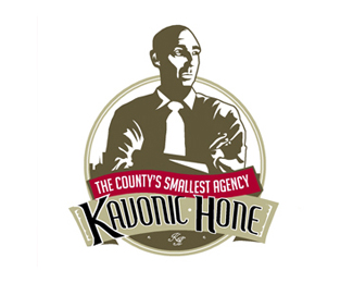
Gerard Kavonic is a one man ad agency. His company is in desparate need of make over. He is the brad and wanted to be the logo. please give me feed back on font and illustration as i think the both need work.
As seen on:
www.agentorange.co.za
Status:
Nothing set
Viewed:
1445
Share:
Lets Discuss
I'm not sure about the font but the illustraion looks good to me. I also like the color scheme.
Replythanks lecart, the illustration troubles me, i find the shadows to be too harsh, the left eye and nose need work and more detail could go into the the shirt.
ReplyPlease login/signup to make a comment, registration is easy