Description:
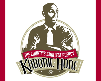
Gerard Kavonic is a one man ad agency. He wanted a logo that was old school. thoughts on fonts and illustration would be greatlu appreacited.
As seen on:
www.agentorange.co.za
Status:
Nothing set
Viewed:
1467
Share:

Lets Discuss
I like this one of the 3 you uploaded…*I'd suggest- lose the box behind him, lose the red line, and play with some cleaner fonts for the 'Kavonic'
ReplyAgreed - definitely play with the font choice. You could keep the box behind him, but have you played with making the box a light shade of red? Something to make him pop a bit more from his background.
ReplyPlease login/signup to make a comment, registration is easy