CRA logo 3
by BrandonBarnard • Uploaded: Sep. 08 '08 - Gallerized: Sep. '08

Float
(Floaters:
32 )
Description:
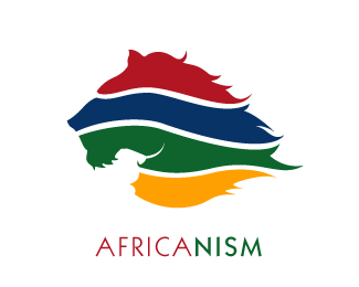
A relocation company based i south africa but expnading into the rest of africa. They relocate people into africa for work. The trick was to create a fresh iconic african logo, my quest was be orginal in how i styled africa. The colours were imporatnt did not want to look gay pride but wanted it to be very colourful.
As seen on:
www.agentorange.co.za
Status:
Nothing set
Viewed:
36928
Share:

Lets Discuss
hola! s%FAper dise%F1o.
Replyyeah this by far the bolder design, the client went forthe diagonal arrows.
ReplyNumber 1, definitely! Totally Afric-ish! %3B)
ReplyDef the best.
Replycool! I love this icon!
Replyfunny thing is you never know what people are going to like once a design is out there, the brand becomes what public say it is.
Replylove these sort of logos. making a full shaped body with several different parts. this one just works out great with the african continent. congrats at your colorsheme choice!
Replystyle man
Replylove the logo, and the type is great too. May i ask what font it is?
Replyso you like the logo then Tonfue, it would be better if that came from a hot girl
Replybrandon, i'd like to dive into there naked and roll around! lol!
Replylol, you guys are all crazy... what the hell lets do it!
Replyvery fine
Replylove them colors
Replygreat execution my man!**
ReplyHey Brandon, I love it. The colours capture the heart of Africa - vibrant and full of life. Makes me miss the Mother Land...
Replythanks guys!
ReplyBeautiful!
ReplyI like this
ReplyPlease login/signup to make a comment, registration is easy