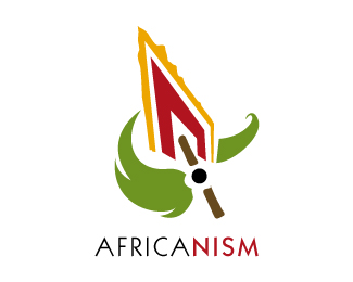
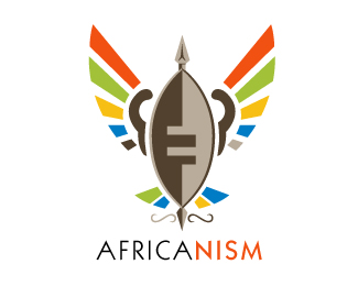
Afrikanism // Africanism
by BrandonBarnard • Uploaded: Apr. 28 '10

Float
(Floaters:
31 )
Description:
This is a private collection of South african logo's that i am working on called Afrikanism spelt with "K"
As seen on:
www.agentorange.co.za
Status:
Unused proposal
Viewed:
12020
Share:


Lets Discuss
Look like Erykah Badu (: Nice.
Replyyeaah looks great Brandon!!
Replythanks Oronoz, that means alot coming from a designer of your calibre
Replyand to you too, Type08
Replylovely piece, colors are spot on.
ReplyGreat... awesome colors. Congratulations....!
ReplyNice colors and a strong mark. I could do without the white negative space coming up on her neck though. With the negative space on the hat merging with the negative space on the neck, it looks like a hook. Might just be me though. If anything, perhaps thin down the weight a bit on that area. Looking good though.
Replyi like this one:)
ReplyThanks for your feed back Ocularink, will take that into consideration.
ReplyQuite nice. I agree I'd lose the lower left neg space on neck. And I'd size/position the earring so that the interior shape (brown) is the full circle and only the outer white portion breaks the neck line. IMO.
Replygreat thought....
ReplyLike it! :)
ReplyGreat logo. Love the colours. GO AFRICA!
ReplyPlease login/signup to make a comment, registration is easy