Float
(Floaters:
18 )
Description:
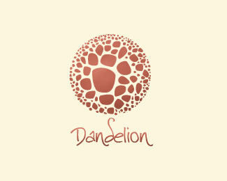
Dandelion Logo looking for critiques :)
Status:
Client work
Viewed:
5768
Share:


Lets Discuss
hmm.. I'm still not sure if I find this too close to the 'act' logo
ReplyThanks for the critique barba, is that positive?
ReplyThere's several of these circular-filled logos going around...I don't think its too close to act, but they are similar. I do have to say though, the background and logo color together make it sort of hard to see what's going on. Maybe make one or the other a little darker?
Reply%5E%5EI agree, looks good but needs more color contrast
ReplyThanks guys!**Updated, tone sur tone color. :) critiques, please!
ReplyWithout the word 'Dandelion' under the illo, I wouldn't know what it was. It's beautiful, it is. But the logomark doesn't scream 'dandelion' to me.
ReplyI know, JF%3B need more work. Thank for the critiques! :)
ReplyThe color is awful, but the design is solid. Although I agree it doesn't say dandelion at all either.
ReplyThis would be nice to see on a white background with a stronger color. It's an interesting shape, no matter what you call it.
ReplyThanks for the comments, Guys. Color updated :) i hope thats better.
ReplyPlease login/signup to make a comment, registration is easy