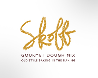
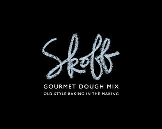
Logo for Skoff Pre-mixed cookie dough
by LloydCreative • Uploaded: Jul. 01 '09

Float
(Floaters:
4 )
Description:
Logo option for handmade cookie and scone dough company.
Status:
Unused proposal
Viewed:
5058
Share:

Lets Discuss
Holy cow, how many options did you give your client?!
ReplyOh wait, just 6. Nice set of options by the way.
ReplyHa, thanks Kevin... your first comment made me laugh... and my wife agreed. She said 'you spend too long doing too many options ' - but like I said to her, the ideas have to get out of my head to make room for new ones. Thanks for the kind words.
Replyalso nice:)
ReplyI like this as a mark, but like the more illustrative concept better.
Replythis is my favorite, but the eaten portion seems odd to me, like it needs some depth.
ReplyThanks DotFlo, Ryan and George - appreciate the comments.
ReplyI think this could work pretty well.. have you considered centering an %22S%22 and have it take up most of the inside circle? Then Skoff could possibly sit below the mark.. the only reason I ask is because I think you could have it more readable when reducing its size.. and on certain applications you could break the logo down and maybe skoff doesn't always appear with the icon.. kudos!
ReplyPlease login/signup to make a comment, registration is easy