Float
(Floaters:
50 )
Description:
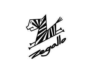
Logo for fans of zebras.
Status:
Unused proposal
Viewed:
11390
Share:
Lets Discuss
fun style.
Reply:)
Replycute zebras:)
Replystrict stallion :)
Replyhe he - like the style.
Replythanks
ReplyGreat Style!
Reply:)
Replyguys, thanks!
ReplySo cute! :)
Replyepicantus, thanks
Replypretty damn sweet!
Replyreminded me instantly on the old Brandlogic%60s logo, but nonetheless, great symbol. don%60t care about the type tho.
Replylecart, wizemark, thanks! **wizemark, unfortunately, or fortunately, but I have not seen the old logo Brandlogic )
Replylove the style of this... nice.
Replylove the zebra. it\'s very fun and playful and has a unique style. i don\'t care for the type that much. i don\'t think it relates to the mark at all other than being on the same angle (the angle works well btw). i think a nice custom geometric type with the same whimsical shapes would make more sense.
ReplyI have to agree with Colin here. Love that zebra, but the type feels a bit rushed. A little more type love required to take it to the next level.
ReplyWOW :)
ReplyPlease login/signup to make a comment, registration is easy