Description:
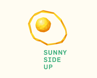
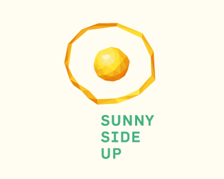
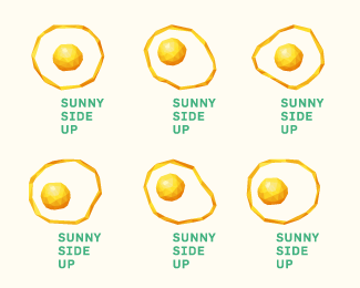
Working on an offshoot of a previous, unused logo (http://logopond.com/gallery/detail/216683).
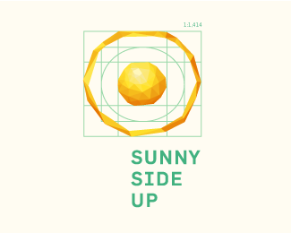
This is a study of proportions as well, as I worked with 1:√2 (1:1,414) here.
Status:
Just for fun
Viewed:
10900
Tags:
lowpoly
•
low poly
•
poly
•
system
Share:



Lets Discuss
I love the idea and the dynamic part!
ReplyYour stuff always deserves closer attention Art... Machine!
ReplyGood day - This logo is very similar to my original creation. I would like to invite you to reconsider posting this design publicly. Both the name and the concept have been copied. Please find my logo design here: http://logopond.com/gallery/detail/59389. I look forward to your response.
ReplyHello again,
ReplyPlease note that this logo has been sold and if my Clients decides, they will proceed with legal action against your plagiarism and with my full backup. They have been notified.
My design was created, posted and showcased in 2009:
http://logopond.com/gallery/detail/59384
http://logopond.com/gallery/detail/59389
http://logopond.com/gallery/detail/59386
I will be monitoring your profile to check if you've removed this design or not. Otherwise, I will report you to Logopond as this is not the kind of activity that true designers should be promoting.
^ good luck with that might stir up case for Others that were prior to your "IDEA" Sunny Side up is nothing new. Plus these are totally different Bernard.
Reply^ I agree, I really can't see the issue here at all. Perhaps emailing Julian privately would've been a little more professional than the killing a fly with a sledgehammer approach?
Reply@brandon barnard: These concepts are quite different actually. The only similarity is the name and well... the odds of more than one person making a sunny side up egg and calling it... Sunny Side Up... I mean, think about it.
ReplyMight as well go chase down everyone who has done a logo with Africa in it while you are at it.
ReplyHi Brandon,
Replythanks for letting me know about your design which I haven't seen before.
As explained in the logo description, this is an offshoot of another logo.
The name "Sunny Side Up" is pretty self explanatory given the image of a fried egg. Hardly a "concept" to steal, copy, rip off or plagiarize. As Mike (logomotive) already mentioned, this thing is so self-evident, it would not be coincidental but rather very likely that others have created something similar - even before you.
Apart from the "concept" the visual design itself is very far from yours. No problem here either.
My logos have been copied numerous times so I sympathize, I really do. But this is not what happened here. I am sorry that this coincidence has upset you. But I will not remove this.
I totally disagree, I feel my idea was jacked and I have every right to express my opinion, as this is an open platform.
ReplyStyle maybe different, but lets be really honest, there is no doubt where the idea came from which is my original logo.
As per the Africa comment, logomotive, no one has stylized Africa more that me over the years but that is not what we are talking on this sunny side up logo!
Ok so lets wrap this up, Julian, you up gave very eloquent response & yes maybe this is a total coincidence but I don't think so & I don't agree so let just leave it here!
I have made my client aware of the situation and they are seeking legal advice.
^Since you own the sunny side up egg, will you sue me if I have one for breakfast?
Replyha ha ha
ReplyAgree to disagree!
ReplyMoving on...
Seeking legal advice? OH come on! LOL
ReplyHi again Brandon,
ReplyI support you for expressing yourself here and doing what you think is right.
It's clear that you are upset by this. I'm sorry but let me reiterate: This was originally a sun, which reminded me of a fried egg and hence this offshoot and its naming. The outcome happended to be similar to your logo. An unsurprising coincidence. That is all this is.
You do have doubts about this as you have demonstrated by making the two mutually exclusive statements, both that "there is no doubt where the idea came from which is [your] original logo" followed by "maybe this is a total coincidence".
So having made the concession that this may indeed be a coincidence you might want to be more mindful of your phrasing. Were I more affected by unprovable accusations I'd be tempted to deem this defamation and consider legal counsel myself.
I think you are right in letting your client know about this issue. I did the same when my logos were (actually and demonstrably) copied. I am happy to talk to your client about this.
Julian 'jacking' your logo? Man you are some piece of work. Your own folio be it design or photography is in fact quite commendable but by throwing this little tantrum just lost all respect from me.
ReplyLegal action would be a complete waste of time and money. There is no plagiarism here. And even if you could prove 'inspiration', that is not illegal. Personally, I doubt you could even prove that. I don't see anything similar between your design and Julian's than that they both represent an egg and are both called sunny side up. And I'm pretty sure neither can be legally registered/owned outright since they are both too common. They otherwise do not in any way look even mildly related. Everything but subject matter and name is different. Sorry, Brandon, but you are wrong on this one.
ReplyHope he comes back and reads what you've posted. That last link is straight up stolen.
ReplyThanks for your feedback Climax Designs
ReplyThat indeed is a total rip of my logo
which came first? the chicken or the egg?
ReplyClearly the egg, and then the chicken made a bunch of illegal duplicates. :p
ReplyPlease login/signup to make a comment, registration is easy