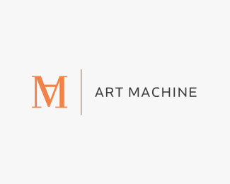
Description:
I am Julian Hrankov, a self-educated logo & corporate design specialist & head of Art Machine, a Berlin-based graphic design studio.
Status:
Nothing set
Viewed:
16384
Share:


Lets Discuss
Congrats on the feature! Nice showcase.
ReplyGenius, I love it:) Fantastic use of the M and A.
ReplyWell deserved feature.
ReplyBravo kudos, mate! You've got a real well-rounded showcase here! Brilliant stuff!
ReplyHey thanks all you people!!! :-)**I'm so happy about it!
Replyam i the only one that also sees a pencil made from the A being upside down? i think that makes it even more meaningful. great job!
Reply**GENIUS**. Seriously.
ReplySublime
Reply@micah: Compliment on your good eyes, nobody saw it. : )**@all others: Thank you people for all your nice comments! Makes me very happy and go on creating and learning : )*
ReplyI like this logo very much, well done. Is there a reason to the mark having serifs and not the type next to it?
ReplyDanke, dache.**Well, first of all the serif type is supposed to express diversity by the contrariness of serif and sans serif respectively classic and modern. **Second, the design is supposed to appeal to a wide range of people, modern as well as more classic/conservative.**Furthermore I wanted the logo to work a little against all the stylish, web2.0, shiny, heavily overused styles, typefaces and designs.**And beyond I think the chosen style makes it more memorable.****Hope I could clarify things.****
ReplyArt,great logomark.Funny thing is the first thing I saw was the pencil.Man I love meaningful logos.
ReplyThank you very much Fabian.*I'm glad you saw the pencil.**And I love 'em, too! : )**
ReplyThis was already a great mark and now the pencil! Man I'm kickin myself. Way to go bro.
ReplyIt was about time you got Featured, mate :)))))))) I'm surprised it hadn't happened earlier :)))) Chhers %3B)
Replyi think this is overrated.
Replyplease explain more photosnaper.
ReplyHello photosnaper, please back up your statement with reasons.
ReplyYeah, I too would love to hear your reasons why, photosnaper. The way I see it, this logo is underrated. Not to mention, the designer is only 19!! Can we say natural born talent!?!?
ReplyThank you Ocular, for your support and the big compliment, many, many thanks! %0D*But I have to admit something, it was my birthday a week ago and I'm 20 now!%0D*And I can only say I think I still have A LOT to learn about design...but it's much easier to go that way with all your support and input at this wonderful place.
ReplyOh, for me this logo is just a simple ligature, i guess everyone see the %22A%22 easily it is so obvious.* For more information about ligature, please go to this link : http://www.bamag.com/email/0-MNH9673-email/7ecHEs/BA0363LogoOfLetters.pdf
Replya ligature? let alone a simple one? I disagree. I've never seen M and A linked together in any text like that, haha. perhaps if it wat t and i, or f and i. This is unique, and i like it Art Machine (ps very jealous to learn you're so young and that talented).
ReplyDikkers, thanks for the backup and the big compliment!
ReplyThis logo reminds me of typical Italian fashion house logos, classy and yet simple. Nice work.
ReplyThank you centrus. :)
ReplyGenius! I love this so much. Jealous I didn't do it :-P
ReplyThank you very much Claire.
ReplyAgreed, this is great, Art.
ReplyVery nice stuff, saw the pencil/%22A%22 right away!!
ReplyGood eye Alex. Thanks for the comment.
ReplyThis is very smART. I see the 'A' immediately. I had a similar approach with one of my logos (HomeWork). It was a play on a 'H' and a 'W'.
ReplyHehe, thanks hardy. Yes, I saw that one. Good one :)
ReplyWhoa with the list of comments and praises! I guess you don't mind if I add my congrats on a brilliant logo on here right?
ReplyOf course not OMNI, very appreciated!
ReplyAHHH! I didn't even see the pencil! Okay thats the cherry on top for this logo. brilliant.
ReplyThanks a bunch!
ReplyMan just notice the upside down a wonderful! nice concept
ReplyIt really looks like a machine. And as the 'A' looks like a pencil. Its %22ART MACHINE%22
Replydamn... ive never commented on this!.. nice.. looks just like you!
Replysmallbig: Thanks!**watsgoing: I appreciate it!**nido: Well, thanks for your comment. Ehhhm, honey, how do you know what I look like again?
ReplyI just fitted my logo with a new typeface. Hope you like the update.
ReplyI think it fits nicely Julian, me likes!
Reply%5EI'm with you Nido, I know I commented before Julian must a reuploaded?
Replyi like the new font a lot!.. **..does it count if i cant even remember the old font?
ReplyThanks a bunch guys.*nido, that's a good thing. The old one looked kind of dated to me. It was %22Sackers Gothic%22:http://new.myfonts.com/fonts/agfa/sackers-gothic/
ReplyHa, I always assumed it was Gotham.
ReplyDid you receive my emails Julian?
ReplyPlease login/signup to make a comment, registration is easy