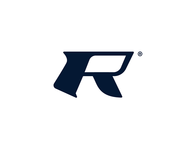
Kafer
by ArtDemix • Uploaded: Mar. 27 '11 - Gallerized: Oct. '11

Float
(Floaters:
102 )
Description:
Manufacture of musical instruments.
Kafer - bug (Ger.)
Status:
Unused proposal
Viewed:
8229
Share:

Lets Discuss
Cool idea!
ReplyNice concept!
ReplyArtemiy, you are Great!
ReplyYeah almost German ... K%E4fer has two dots ... anyway ... it looks great and it's a veeeery good logo !!!
ReplyVery good musical instrument logo. Thanks for the float on mine! :-)
ReplyIt is glad that was pleasant
ReplyVery nice concept!
Replyspasib, Sergey*zakazchik priyal pravda drugoy variant, no mne etot nravitsya ))
ReplyThis illy works perfectly with the type!
Replyawesome, congratulations!
Replywow, yes i am ))*thanks!
Replynice :%5D%5D !
ReplyGreat style as always. Congrats!
Replyvery nice. great match of type and icon.
ReplyJust read the Bug bit. Brilliant.
Replythanks you all!
ReplyNice logo design. Simple but gives the right signal.. Good job
ReplyLove it. Only change I would make is that tiny line between the head and body - either make it wider or delete it.
Replygreat! very nice.
ReplyAlways loved this!
Replycreative one. good job
ReplyTotally dog it! Good job!
ReplyNice idea.
ReplyDefinitely memorable and unique too.
ReplyGreat logo design, i like the simplicity in it..
ReplyThank you everyone )
ReplyNice logo design*
ReplyExcellent*
ReplyReally great work!
ReplyThanks! )
ReplyPlease login/signup to make a comment, registration is easy