Description:
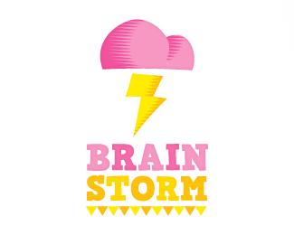
Work in progress for a School Project, I could really use some critique on this one (my debut in LogoPond!).
Thanks!
Status:
Work in progress
Viewed:
3151
Share:
Lets Discuss
nice one ... thunder and lightning ... curious about the next steps
ReplyBernd: To be honest, i'm curious about the next steps too... my main concern is: Is the brain/cloud recognized as such?**Faca: Te creaste una cuenta para joder con eso? :P
Replyyou know ... art is what you see in it ... I see a very sweet storm (the used colors) and a brain that looks a little bit different than a brain should look like ... but who cares ... if you want to show the world as it is you have to use a camera ... I like it ....
Reply%5E good point. i think you're off to a good start ariel. love the handmade feel here.
Replyagree that the handmade feel is great here. Would like to see it take on a more recognizable brain shape, and i don't think you have to do to much to get that. I'd round the bottom of the cloud a little bit, and make the lightning bolt a little smaller and of center so that it acts as the 'stem' of the brain. As far as type, you've done good, even with the colors. Yellow is extremely risky with type, but it works well here. I'm not sure i'm a fan of the triangles underneath, as it gives it a strange country fair craft booth sort of feel. But then again, I don't know the context, so that could be what you're going for. Welcome to the pond and this is a great start! Good luck!
ReplyPlease login/signup to make a comment, registration is easy