Description:
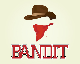
Logo for a project, its supposed to be for a western wear company, I liked the idea of incorporating a "bandit" with a bandana.Critiques welcomed...
Status:
Nothing set
Viewed:
9584
Share:


Lets Discuss
Like the mark, but I'm not to keen on the type.
ReplyThanks Farmill
Replyi like it, but i'm not too fond of the kerning between the 'b' and 'a'. i agree with farmill as well about the type overall.%0D*%0D*also, with the details you put into the scarf and hat, how would this look when you scaled it down?
ReplyAgree with Farmill. The type looks western but it just doesn't fit the mark. I don't like the joint between the B and the A. The mark looks great btw.
ReplyThe type looks more collegiate than western. Regardless, the kerning on the type is horrible, but the mark is kind of cool though.
ReplyWhat does %22collegiate%22 mean? Sorry, English is not my native. :)
ReplyThe type you've chosen looks like the fonts used in American college/sports logos.
ReplyThanks sdijock. It's not my logo, I just commented on it.. :)
ReplyPlease login/signup to make a comment, registration is easy