GetFast
by AntonioCalvino • Uploaded: Jan. 06 '18

Float
(Floaters:
4 )
Description:
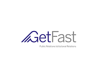
GetFast Logo Design.
Customers desire is to approach its audience in reliable, simple and clean ways.
On these three needs, the aim is to choose a linear, clear, and knowing that in the future the business image will also be on the web great for the web: the Benton Sans. Soon after, the analysis focused on corporate colors, targeting the choice of a blue and gray union, thus bringing security and confidence feelings that are fundamental to the company in question.
The concept of the brand is born from the three lines that merge with the G of GETFAST and want to indicate exactly those lines that we are used to seeing in the classic economic charts but in this case seem to shoot the getFast logo quickly , Resuming precisely the speed effect and therefore the FAST of the company name.
Status:
Client work
Viewed:
1474
Tags:
branding
•
brand
•
marks
•
logopond
Share:

Lets Discuss
Please login/signup to make a comment, registration is easy