Description:
A Powahouse is a small apartment building that packs a big punch. It’s also a Boston-based project, currently incubating, that’s scheduled to hatch first thing in 2010.
The basis for the name “Powahouse” comes from the fact that this project is a way for homeowners to make their apartment a renewable energy power plant as well as the idea of setting a powerful example in efficient design and construction. When we first met to discuss their new identity the client expressed their desire to balance the playful take on the word Power with a more serious mark.
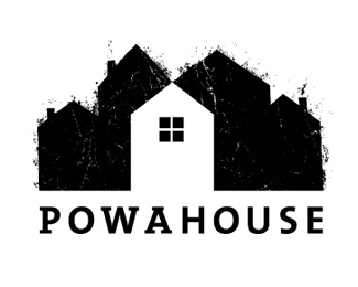
The concept for the logo stems from the idea of a carbon footprint, or better yet, the lack there of. The focal point is the stark, white house-shape formed in the negative (or positive if you will) space between the dirty, inefficient homes. The type is clean and modern reflecting the ideals of Powahouse.
As seen on:
Status:
Client work
Viewed:
2023
Share:



Lets Discuss
Please login/signup to make a comment, registration is easy