WIP
by AlexanderSpliid • Uploaded: Jan. 02 '10

Float
(Floaters:
22 )
Description:
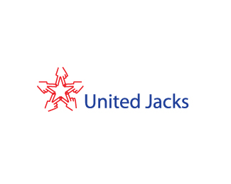
Logo for a sales company, (field marketing and call-center)
The handshake symbolizes a good, fair, honest, profitable deal, and brings in a human touch.
Status:
Nothing set
Viewed:
11878
Share:


Lets Discuss
Hi guys. As this is a WIP i am looking for some help here. I think the concept is there, but i'm not sure the mark and type is. So i've be happy to hear any thoughts you have on this. Thank you :)
ReplyHey Alex, nice concept. I saw handshake immediately. Maybe to shorten the lines of the front hand (fingers) a bit and make the space between 2 text rows smaller IMO...
ReplyIt reminded me of allstates.. not bad tho
ReplyUpdated!**I think it's better now, thank you alen
ReplyI do to, you're welcome!
ReplyPerfectly.)
ReplyI've seen thousands of hands in logo designs, but never so well crafted like this. Chapeau!
ReplyI too saw it instantly. Very nice simplification and twist on a tired concept.
ReplyThanks a lot guys. I always belived the concept was strong in this one, but never felt like i nailed the execution 100%25... Client went with another mark of mine, so everthing is good :)
ReplyPlease login/signup to make a comment, registration is easy