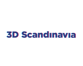
3D Scandinavia
by AlexanderSpliid • Uploaded: May. 18 '10

Float
(Floaters:
2 )
Description:
Logo done for 3D Scandinavia - The company wanted a new identity because of a name-change and their plans to not only sell 3D glasses. This mark combines the nummer 3 and letter D in a mark inspired by Scandinavian logodesign from the 70's -> although i had to add some gradient at clients request. The type is "custom" but based on the Gotham family. Hope you like.
Status:
Client work
Viewed:
3862
Share:


Lets Discuss
Nice. Perhaps you could accentuate the depth created by the red dash (it does seem to float behind the D shape). **heres a quick sketch of what I mean: http://logopond.com/gallery/detail/104995 :)
ReplyThank you, i hear your idea and it could probably be more dynamic, but it was qlients request to keep it subtle and professional. *Client is happy with it now, so i won't be working more on this :)
ReplyPlease login/signup to make a comment, registration is easy