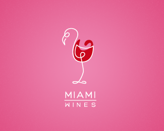
Description:
Had to do this as it crossed my mind ;)
As seen on:
behance.net/alexwende
Status:
Just for fun
Viewed:
5445
Share:





Lets Discuss
nice!
Replyi like this! have you put the M upside down for the W in wines? or is just the font?
ReplyThx! @Dean Yes, you got me... I flipped the %22M%22. %3B) I thought it gives the whole typography a balanced feeling because of the %22M%22 above the %22W%22
Replyhere you go ... bravissimo ... amico mio ...
ReplyThanks again Bernd! %3D)
Replybeautiful flamingo, Alexandr)
ReplyPlease login/signup to make a comment, registration is easy