Description:
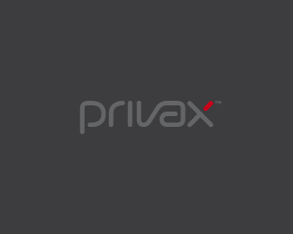
**WIP** 3rd proposal For a VPN Service (virtual private network) named Privax which helps secure your internet connection + helps protect your online anonymity through encryption. Custom made font. The concept: the x symbolize an abstract protective shield with which you surf anonymously, the red bar is the outside world / hacker etc...
Status:
Client work
Viewed:
25678
Share:

Lets Discuss
**updatet** the colors
ReplyGood work on type, Alex.
Replyanother real nice type approach on this piece too, Alex
ReplyLooks great! I love the typeface you've come up with here. One thing that nagged at me was that it looked more like %22privex%22 than %22privax%22. I think my brain is trying to flip the %22a%22 into an %22e.%22 I think the reason I initially thought it was an %22e%22 was because the bottom of it is almost completely round, which makes me think that it is a reversed, upside down %22e.%22 It could just be me, and if it is, please ignore my ramblings... Keep up the good work!
Replythanks guys!**@ mwgriffin: you're absolutely right, good eye. :) **It reads better and it looks a lot better more %22techy%22 now, thank you!!
ReplySuperb to me, Alex!
ReplyWay to tighten it up mate! Nothing really comes to mind in terms of changes. I'm liking this very much! I'm having a tough time deciding between the three concepts you've got on the table. I feel like I'm just debating between the shield concept and this one. The other one, while I like it, doesn't really feel like it would fit a vpn service... Keep up the good work. I like the variety you've got going. It's always great to have options from a standpoint of making choices based on contrast and perspective.
Replywow, this looks great!
Replynailed it. you have some good choices for this client. sweet.
Replygreat job!
ReplyThanks folks, I will present this three designs to the client now..., lets hope he likes the proposals :)
ReplyGood shot Alex!
ReplyThis got approved just now, thx again for the help everyone :)
ReplyCongrats ...this is damn techy :)
Replycongrats, Alex. this is great.
ReplyMind if I ask which typeface, if any, did you use as base? Thanks.
Replythx! **@minusfive: All three typefaces/proposals for this client were made from scratch :)
Replyreally nice!
ReplyLike how you turned the idea of protective shield
ReplyNIKE!!!
Replythx danny %26 Audrius!**@brandcolour: what do you mean by %22NIKE!!!%22 ? :)
ReplyAll these are sweet! Lucky client.
ReplyCongrats, its a great design and concept.
Replythe design is so simple, like it,
ReplyI went here because I want to comment about the simplicity of it's type font, but after reading your description I was amazed on how you portray the company with the simple %22X%22
ReplyPlease login/signup to make a comment, registration is easy