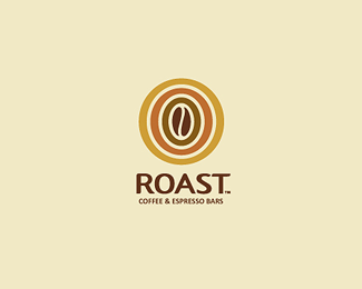
Description:
Roast will be selling high quality finished coffee, hot choclates and other coffee related beverages in their stores/bars in Sidney. The colured concentric rings stand for the roasting process of a coffee bean.
As seen on:
http://roastespresso.com.au/
Status:
Client work
Viewed:
13045
Share:

Lets Discuss
nice one alex..
Reply%5Eindeed
Reply%5Eyes
Replyinteresting ...
ReplyCool logo, Alex!... Love the type too :)
Replyso simple and beautiful
ReplyThank you all folks! :)
Reply*updatet* refined the kerning %26 added the subline with a slightly modified Thesis TheMix italic, feedback is appreciated :)
ReplyVery nice logo. Don't really like the type for ROAST, too neutral for me (the S looks stretched too...). May be working on some soft sans with curve-to-corner terminals would be a way to add some %22coffee %26 cream%22 feeling to it...(fontshop.com/fontlist/genres/soft_sans_curve_to_corner/).
Replyi like it so much..:)
ReplyNice and clean!!
ReplyOne of my favourite coffee based logos.
ReplyGreat colour scheme and nice type too! :o)*
Replylove this, was actually shocked that I hadn't floated before. Shame on me. colors are so dead on for coffee, warm and inviting. nice, man.
ReplyAlso, a big CONGRATS on being the new feature, Alex. SWEEEEEET!
ReplyGreat. Simply great :)
ReplyCool!
Replydas dies ein Liebling von mir ist ... hab' ich wohl schon gesagt ... oder ?! geiles Teilchen ... !!
ReplyPlease login/signup to make a comment, registration is easy