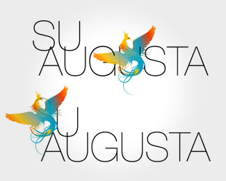
Description:
fashion brand. Logo is to represent vivid colours and forms characteristic for the brand.
Status:
Nothing set
Viewed:
1662
Share:
Lets Discuss
Unique. If it were me, I would let the mark stand alone from the type. Even so, sweet illustration!
ReplyUse the horizontal placement of the mark in the top version, but just push it up vertically so that the tail is sitting in the second %22u%22 of augusta?
ReplyI really like the way 's' forms right into the other slim letters...inaccessible at first? yes, but thats what makes one want to look at it and pay attention...you know? Pls keep the one below, it works in its own unique way.
ReplyI like the bird and its colours so much
ReplyPlease login/signup to make a comment, registration is easy