Description:
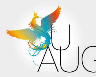
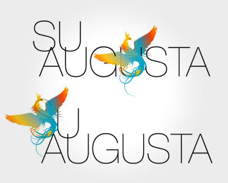
fashion brand. Logo is to represent vivid colours and forms characteristic for the brand.
Status:
Nothing set
Viewed:
1677
Share:
Lets Discuss
nice bird.. but maybe too complex?
ReplyThis is a common mistake - I read %22U Augusta%22 at first sight. At second sight, the %22S%22 behind a bird still isn't obvious and looks like a mistake.**Illustration is very nice though :)*(without the %22S%22 line)
Replynice bird
ReplyI can appreciate you trying to integrate the mark with the type but in this case i just dont think it is working. The two elements (word and mark) are very much battling each other. Find a way for them to work with one another and you're off to a great logo.
ReplyPlease login/signup to make a comment, registration is easy