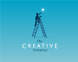
The Creative Company
by AJGagnon • Uploaded: Oct. 20 '08 - Gallerized: Oct. '08

Float
(Floaters:
65 )
Description:
Initial Comp for The Creative Company
Status:
Unused proposal
Viewed:
83652
Share:


Lets Discuss
I like this concept the most - good update to your last version. Fav'd.
Replywere you're intentions to have the 'C' be all white because I see some very faint transparent lines running through it? If you intended to keep the faint lines, I suggest having an all white 'C'.%0D*%0D*This is my favorite concept out of all your comps.
ReplyI agree with gyui. If you have an opaque C would be even better
ReplyNice type!
ReplyGood Idea George, is there a way to update the logo or do I have to re-upload a different file?
ReplyOverwrite the file, it's only a minor change.
ReplyUh, yeah... how?
ReplyFirst, rename the updated file. Then go to edit/delete, click on the logo (not the minus symbol) and re-upload the renamed file.
Replyhaha okay figured it out now.
Replyhm... I hate transparency idea at all... but I really love this one.
Replydon't like. dirty
ReplyVery nice.**Nitpiks: The colors are a tad muddy. Maybe bump the intensity up a notch.**C and E should be the same weight as the rest of the letters. Right now they are both bigger and heavier. **Maybe letterspace THE and COMPANY out a bit?
ReplyNice depth on the mark. I like it:)
ReplyAJ - I've taken another look at this logo and I still love the mark, however, the type bothers me. I don't think it's necessary to make the %22C%22 and %22E%22 larger. There's enough going on in the mark itself for interest-sake, no need to play with the type too. I would keep the type simple and clean, like in your other versions. Let the mark do all the work.
ReplyIt is not reflected here on his site:*http://www.leschinois.com/**But this dudes logo is a %22C%22 with this same treatment. I have his business card.
ReplyThanks for the critique Steve, I agree with the C and E scale issue. They do seem to compete a little bit.
Replyyour use of color is nice.
ReplyAwesome
Replynow it's good.*too bad it's not printable on b%26w
ReplyI dig this one the best of the 3
Replyvery beautiful%7E
ReplyLike this one, good thought and for the C and E i think it shud remain the same as it adds a majestic feel to the mark! IMO
Replylove the colours! wonderful work!
Replynice colors and gradient... but a logo should also work in b/w.
ReplyPlease login/signup to make a comment, registration is easy