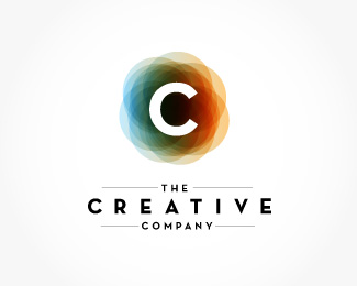
The Creative Company
by AJGagnon • Uploaded: Oct. 20 '08 - Gallerized: Oct. '08

Float
(Floaters:
57 )
Description:
Initial Comp for The Creative Company.
Status:
Nothing set
Viewed:
17611
Share:

Lets Discuss
:D... nice!
ReplyI will have to take my friend's side here (logo made by Relevant):*https://incspring.com/brand_details.php?brand_id%3D255
ReplyThanks Type08, I was unaware. That makes the decision a little easier!
Replyit is the same concept as relevants.. but least you did a good job
Replythis is best
ReplyHaha, nice plug. Way to beat me to the punch!
ReplyDefinitely this one over the other comps. Don't worry about the inspring version. It's for a church...completely different markets and yours looks better anyway. The other one looks like clip-art.
ReplyThe shadow of the ladder is a bit off, as the source of light (the star) is upper right, the shadow should extend slightly to the left (instead of slightly to the right as you have it). Also the figure is awkward, especially his left foot, upper thigh, and hair. Personally, I find there to be a lot of tension within this scenario. I wish he were holding onto the latter as he reached for the star, as well as appearing to be more anchored. Skipping ladder rungs and the hyper-extending reach make our hero look very awkward. I'm just waiting for him to fall off this ladder! %3D(
ReplyHi guys, I'm new to this place, but i just wanted to comment on the issue of the logo being inspired on, or looking like another persons logo. The reality is that a lot of designers have similar ideas and visions and they all want to create something new, catchy, something that has never been seen before. To give you an example, a logo similar to this was made back on 1997 for a company called Apice multimedia. It is impossible for us to know if half the world around their is something similar to what we are doing, because their is a huge %25 that it might be that way. (Research, research, research)So never get discouraged if your logo looks similar to another, just keep hitting it until you get something that's different, new and you feel proud of, and remember, is always good practice. We are on this industry to learn and become better artist so always keeping a good and positive attitude will help you art, your clients and your life.
Replyi really like this logo, it's very inspiring!*really nice work on it!
Replycreative indeed
ReplyThis was always one of my favs, nice work!
ReplyHi very nice and this is perfect for my company can you please Email me at anthony@supahfilms.com
ReplyPlease login/signup to make a comment, registration is easy