
Float
(Floaters:
31 )
Description:
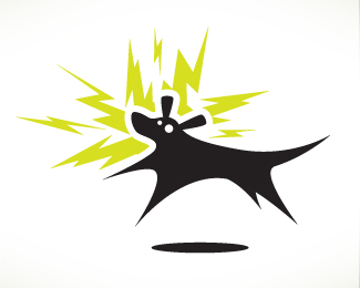
Logo for an apparel company.
Status:
Unused proposal
Viewed:
10129
Share:




Lets Discuss
Love the mark. I see an S, is there significance to that?
ReplyWow, nevermind. Didn't notice it was %24. Must be having a bad day.
ReplyHaha j-CAZ happens to all of us. Love the design 903, very cool idea!
Replythat is awesome, faved/floated! nicely done 903
ReplyYes, faved and floated!
ReplyTook me a minute to notice the %24 but once I did, tight!
ReplyWoa. This is really nice.
ReplyYou guys are the best. Thanks for all the great comments.
ReplyDead on. Fantastic concept/execution.
ReplyVery clever idea and well executed.
ReplyHot dude!
Replyawesome
ReplyVery very cool
Replyvery nice execution!
Replywish that logo was for me :(***very nice!
ReplyFantastic work, bet that will be in the gallery next time.
ReplyQuite nice flow of this logo.
Replyreally excellent execution and concept.*Love it.
ReplyPlease login/signup to make a comment, registration is easy