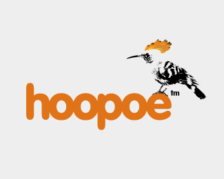
The reason you may not be getting comments/feedback is because there are a few other logos on here that have the same thing going on - a bird perched up on the font. In being constructive, I'd say the bird and font don't really go together that well. Something about the grunge-ness of the bird with the clean round edges of the font doesn't work as well as it could. Have you tried using the Hoopoe bird in another way?
LOL @ Climax**I think Climax's reference is based on the 'hoo' letters in your company name and the similar font being used, and the color reference too. Perhaps different colors and a new type treatment?
ClimaxDesigns got it right. I like the bird treatment with the crest, but the font was bothering me. Once I read Climax Designs post, realization hit. There are other shades of orange if you love that color, but the font has got to go.


Lets Discuss
Any comments would be good. Thanks
ReplyThe reason you may not be getting comments/feedback is because there are a few other logos on here that have the same thing going on - a bird perched up on the font. In being constructive, I'd say the bird and font don't really go together that well. Something about the grunge-ness of the bird with the clean round edges of the font doesn't work as well as it could. Have you tried using the Hoopoe bird in another way?
ReplyThanks for the comment. This was my first go at the logo, not tired anything else. Will have a few more goes with it, and post them on here.
Reply%5E No, just no. Nothing like it lol
ReplyLOL @ Climax**I think Climax's reference is based on the 'hoo' letters in your company name and the similar font being used, and the color reference too. Perhaps different colors and a new type treatment?
ReplyClimaxDesigns got it right. I like the bird treatment with the crest, but the font was bothering me. Once I read Climax Designs post, realization hit. There are other shades of orange if you love that color, but the font has got to go.
ReplyPlease login/signup to make a comment, registration is easy