Description:
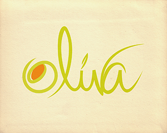
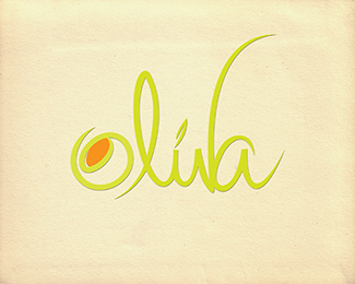
Oliva v2. Handwritten typography, good for a restaurant or bar.
Updated with changes to improve readability.
Status:
Just for fun
Viewed:
3232
Share:


Lets Discuss
Love this! Would a touch of space between the %22a%22 and %22v%22 improve legibility even more and balance out the %22o%22?
ReplyOld version http://logopond.com/gallery/detail/93600**Hopefully this one is easier to read. Comments please.
ReplyThank you for your feedback coloredbean.
Replyagreed, spaces between v and a is much needed, especially every other letters are not sticking with each other like that
Reply%5E%5E%5E agree with the space needed between the v and a.*real nice hand script. good concept. :)
ReplyPlease login/signup to make a comment, registration is easy