Oliva
by 51X • Uploaded: Feb. 09 '10

Description:
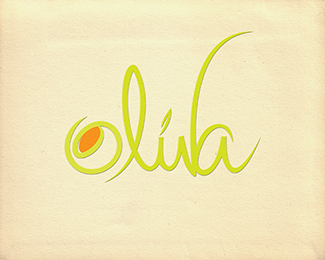
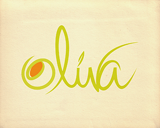
Oliva. Handwritten custom font for a restaurant or bar.
Status:
Just for fun
Viewed:
2745
Share:


Lets Discuss
Feedback please. I've been getting mixed opinions on readability. Thanks
ReplyIt's pretty good until the 'v.' I think the extensions obscure the word more than help it.
ReplyI appreciate your comments. So far 100%25 of people have accidentally read %22olula.%22 Is that what you see?
ReplyI could understand that. The first time I saw it I read- %22olila%22 But like I said, I could see how the 'i' could be confused with a 'u'
ReplyNice style, but I read it as ol%FAla
Replypretty good I read it as oliva
ReplyPlease login/signup to make a comment, registration is easy