

Description:
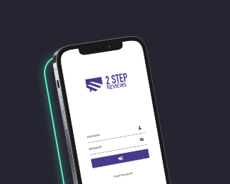
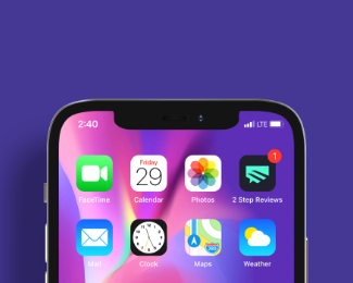
LogoLounge 12 published logo mark + app icon design for 2 Step Reviews - a really effective online platform/mobile app that aggregates a business's online reviews into a dashboard to help their clients gather reviews and grow their business. The logo mark/app icon utilizes a hexagon shape as its foundation, removing the top section of the shape, while introducing two optically offset lines in its negative space. The result is a logo mark with a distinctive personality that combines a unique, abstract shape of a speech bubble that indicates a review from a client together with a 3/4 perspective view of two steps/stairs leading upwards, expressing growth that clients will experience through the 2 step review process.
As seen on:
2 Step Reviews - Case Study
Status:
Client work
Viewed:
833
Tags:
technology
•
SaaS
•
negative space
•
speech
Share:


Lets Discuss
Please login/signup to make a comment, registration is easy