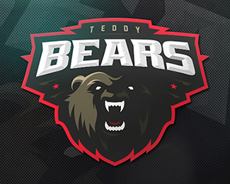
Phantoms
by zerographics • Uploaded: Aug. 22 '16 - Gallerized: Aug. '16

Float
(Floaters:
37 )
Description:
US hockey team
https://dribbble.com/shots/2915521-Phantoms
Status:
Client work
Viewed:
9208
Tags:
•
skull
•
stick
•
hockey
Share:

Lets Discuss
Love it!
ReplyYou have skill, that is obvious. But this sort of thing doesn't really excite, it's been done so often, why should this be considered for any sort of merit?
ReplyI, by no means, am suggesting it should be removed from the gallery. On the contrary, it should remain here. But if we really want to (re)appreciate this style all over again, well, there are a number of designs similar to, if not better than already up on Logopond. Just ask Mike.
@nido different strokes for different folks. there is a lot great stuff here on logopond, i guess gallery doesn't mean it's better
ReplyPersonally I love it! Yes, nido makes a point about how that style of "sports logos" in general is getting perhaps old, but for right now it's fantastic! Really nice colors, shape and overall concept!
ReplyPlease login/signup to make a comment, registration is easy