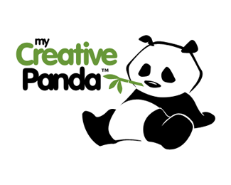
Description:
This is my first submission here. I am still studying this logo for my upcoming website. critiques are very welcome.
----------
edited: for presentation of final logo. :D again, Thanks guys for the great help!
Status:
Nothing set
Viewed:
2376
Share:
Lets Discuss
I think the type needs to be cleaner and less confusing... perhaps by changing the leading and only using one single font style...? Also try simplifying the panda slightly... so it looks like a logo and not an illustration... Other than that I love the character of the design thus far! :)
Replyhi Mason,**Thanks for the comment.*I have altered the leading slightly and took your advice to a single font style.*however, I can't alter the panda completely esp. on the outline of the head because it would look incomplete, but I have done some minor alterations though.**!http://img9.imageshack.us/img9/4624/mcp2.png!
ReplyI love illustrative work. I would suggest going the other way. Since you have a static line outlining the head (I do think a little variation would be good like the white line of the one leg), you should add it to the belly as well. It does look like the head and body are of two different styles.
Replyhi THEArtistT,**Thanks, how about this, any better?*!http://img254.imageshack.us/img254/4376/mcp3.png!**
ReplyYes. Definitely better. I would put a little disconnected space between the line of the head and the shoulder to our right to go with the spaces you have around the belly. But it is a small tweak. This is great.
ReplyThanks for the great help guys*I present the final design*!http://mycreativepanda.com/images/mycreativepanda-zer09.gif!:http://mycreativepanda.com*and can be seen at my %22on the progress%22 site...*
Replyreplace the showcase image with this as well so I can float it!
ReplyImage Replaced. Thanks again!
ReplyPlease login/signup to make a comment, registration is easy